Curandi
Where your profession reclaims its soul.
Designing an identity that heals the healers.


The healthcare sector is plagued by a paradox: those who dedicate their lives to caring for others are often consumed by burnout and depersonalization. Curandi was born with a bold and necessary mission: to “heal the healers” by creating an ecosystem of support, growth, and dignity for health professionals.
Our challenge was to translate this revolutionary mission into a visual identity that could live up to it. How do you communicate authority without falling into corporate coldness? How do you express empathy without appearing weak?
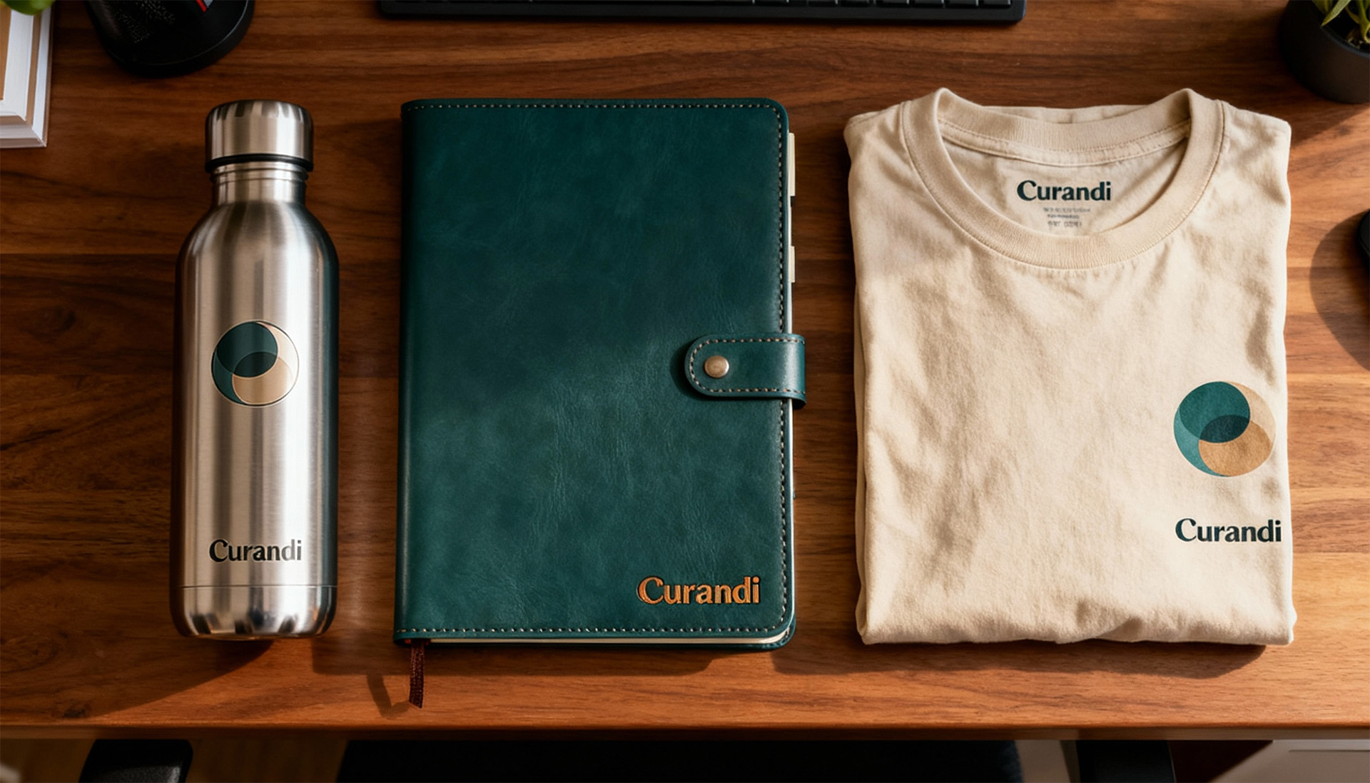
The result is a brand that doesn’t speak of illness, but of rebirth; not of bureaucracy, but of human connection; not of clinical coldness, but of warm, unwavering trust. A visual identity that isn’t just a look, but the very first act of care.
Our process began with a deep market immersion to map emotional tensions and strategic opportunities. We then activated our brand simulation system, a proprietary framework that allowed us to test and validate every element of the project—from the core concept to the color palette and tone of voice—ensuring the final identity was not only aesthetically powerful but also strategically sound.